Logo
Logo
ServicesIndustriesCase StudiesBlogsCareersLet's Connect
blue-white-icon
black-image
Logo
ServicesIndustriesCase StudiesBlogsCareersLet's Connect
burger-icon
hamburger
User-Friendly Mobile App UX Design: The Process, Step by Step
Blogs/User-Friendly Mobile Apps

User-Friendly Mobile App UX Design: The Process, Step by Step

December 19, 2025
Share Now

Table of Contents

  1. 1. What is user-friendly mobile app UX design?
  2. 2. Why mobile UX design decides
  3. 3. What makes a mobile app feel user-friendly?
  4. 4. What is the procedure to design a mobile app?
  5. 5. Six mobile app UX mistakes
  6. 6. When is a mobile app design ready for development?
  7. 7. How to do mobile app UX design with one designer, or none
  8. 8. How 4Labs Technologies approaches mobile app UX design
  9. 9. Frequently asked questions
  10. 10. Design for the thumb, then for the eye

Key takeaways

  • UX is the path, UI is the paint. User-friendly mobile app UX design decides how someone gets a job done. The interface decides how it looks while they do it.
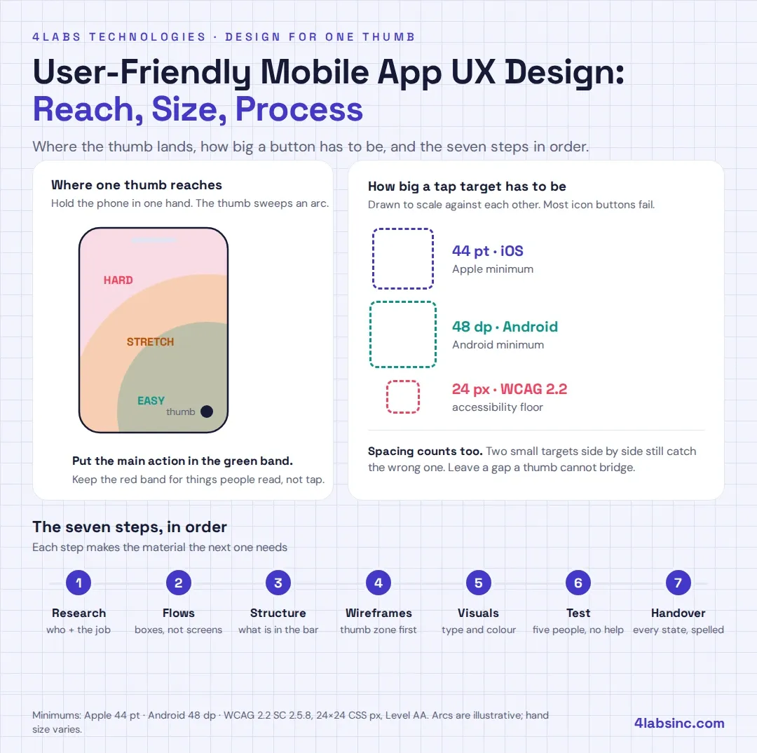
  • The thumb is the real input device. Put the things people tap most within reach of one thumb, and make every target at least 44pt on iOS or 48dp on Android.
  • The process has seven steps. Research, flows, structure, wireframes, visual design, testing, handover. Skipping one costs more later than doing it now.
  • Five testers find most of the trouble. Nielsen Norman Group put it at roughly 85% of usability problems from five people.
  • Most apps fail on the boring screens. Empty, loading and error states get skipped, and that is where users give up.

Nobody writes a review that says "the navigation was confusing". They just delete the app.That is the hard part of user-friendly mobile app UX design. The failure is silent. You see the install, you see the drop-off two screens later, and nothing in between tells you why. The screen looked fine on your laptop. On a bus, in one hand, with a cracked screen protector, it did not.This guide walks through the mobile app design process the way a small team can actually run it. Seven steps, the rules that matter on a phone, the mistakes that show up again and again, and a readiness check before anything reaches a developer. Every rule here comes from Apple, Android, the W3C or published research, not from opinion.

Stay Ahead With 4Labs

Get expert insights, security briefings, and the latest innovations in your inbox.

  • Afghanistan+93
  • Albania+355
  • Algeria+213
  • Andorra+376
  • Angola+244
  • Antigua and Barbuda+1268
  • Argentina+54
  • Armenia+374
  • Aruba+297
  • Australia+61
  • Austria+43
  • Azerbaijan+994
  • Bahamas+1242
  • Bahrain+973
  • Bangladesh+880
  • Barbados+1246
  • Belarus+375
  • Belgium+32
  • Belize+501
  • Benin+229
  • Bhutan+975
  • Bolivia+591
  • Bosnia and Herzegovina+387
  • Botswana+267
  • Brazil+55
  • British Indian Ocean Territory+246
  • Brunei+673
  • Bulgaria+359
  • Burkina Faso+226
  • Burundi+257
  • Cambodia+855
  • Cameroon+237
  • Canada+1
  • Cape Verde+238
  • Caribbean Netherlands+599
  • Cayman Islands+1
  • Central African Republic+236
  • Chad+235
  • Chile+56
  • China+86
  • Colombia+57
  • Comoros+269
  • Congo+243
  • Congo+242
  • Costa Rica+506
  • Côte d'Ivoire+225
  • Croatia+385
  • Cuba+53
  • Curaçao+599
  • Cyprus+357
  • Czech Republic+420
  • Denmark+45
  • Djibouti+253
  • Dominica+1767
  • Dominican Republic+1
  • Ecuador+593
  • Egypt+20
  • El Salvador+503
  • Equatorial Guinea+240
  • Eritrea+291
  • Estonia+372
  • Ethiopia+251
  • Faroe Islands+298
  • Fiji+679
  • Finland+358
  • France+33
  • French Guiana+594
  • French Polynesia+689
  • Gabon+241
  • Gambia+220
  • Georgia+995
  • Germany+49
  • Ghana+233
  • Gibraltar+350
  • Greece+30
  • Greenland+299
  • Grenada+1473
  • Guadeloupe+590
  • Guam+1671
  • Guatemala+502
  • Guinea+224
  • Guinea-Bissau+245
  • Guyana+592
  • Haiti+509
  • Honduras+504
  • Hong Kong+852
  • Hungary+36
  • Iceland+354
  • India+91
  • Indonesia+62
  • Iran+98
  • Iraq+964
  • Ireland+353
  • Israel+972
  • Italy+39
  • Jamaica+1876
  • Japan+81
  • Jordan+962
  • Kazakhstan+7
  • Kenya+254
  • Kiribati+686
  • Kosovo+383
  • Kuwait+965
  • Kyrgyzstan+996
  • Laos+856
  • Latvia+371
  • Lebanon+961
  • Lesotho+266
  • Liberia+231
  • Libya+218
  • Liechtenstein+423
  • Lithuania+370
  • Luxembourg+352
  • Macau+853
  • Macedonia+389
  • Madagascar+261
  • Malawi+265
  • Malaysia+60
  • Maldives+960
  • Mali+223
  • Malta+356
  • Marshall Islands+692
  • Martinique+596
  • Mauritania+222
  • Mauritius+230
  • Mayotte+262
  • Mexico+52
  • Micronesia+691
  • Moldova+373
  • Monaco+377
  • Mongolia+976
  • Montenegro+382
  • Morocco+212
  • Mozambique+258
  • Myanmar+95
  • Namibia+264
  • Nauru+674
  • Nepal+977
  • Netherlands+31
  • New Caledonia+687
  • New Zealand+64
  • Nicaragua+505
  • Niger+227
  • Nigeria+234
  • North Korea+850
  • Norway+47
  • Oman+968
  • Pakistan+92
  • Palau+680
  • Palestine+970
  • Panama+507
  • Papua New Guinea+675
  • Paraguay+595
  • Peru+51
  • Philippines+63
  • Poland+48
  • Portugal+351
  • Puerto Rico+1
  • Qatar+974
  • Réunion+262
  • Romania+40
  • Russia+7
  • Rwanda+250
  • Saint Kitts and Nevis+1869
  • Saint Lucia+1758
  • Saint Pierre & Miquelon+508
  • Saint Vincent and the Grenadines+1784
  • Samoa+685
  • San Marino+378
  • São Tomé and Príncipe+239
  • Saudi Arabia+966
  • Senegal+221
  • Serbia+381
  • Seychelles+248
  • Sierra Leone+232
  • Singapore+65
  • Slovakia+421
  • Slovenia+386
  • Solomon Islands+677
  • Somalia+252
  • South Africa+27
  • South Korea+82
  • South Sudan+211
  • Spain+34
  • Sri Lanka+94
  • Sudan+249
  • Suriname+597
  • Swaziland+268
  • Sweden+46
  • Switzerland+41
  • Syria+963
  • Taiwan+886
  • Tajikistan+992
  • Tanzania+255
  • Thailand+66
  • Timor-Leste+670
  • Togo+228
  • Tonga+676
  • Trinidad and Tobago+1868
  • Tunisia+216
  • Turkey+90
  • Turkmenistan+993
  • Tuvalu+688
  • Uganda+256
  • Ukraine+380
  • United Arab Emirates+971
  • United Kingdom+44
  • United States+1
  • Uruguay+598
  • Uzbekistan+998
  • Vanuatu+678
  • Vatican City+39
  • Venezuela+58
  • Vietnam+84
  • Wallis & Futuna+681
  • Yemen+967
  • Zambia+260
  • Zimbabwe+263
Our Services
Digital Marketing
Staff Augmentation
IT Infrastructure
ERP Solutions
Software Development
Web & App Development
Industries
Cryptocurrency and Blockchain
Banking, Financial Services, and Insurance (BFSI)
Lending and FinTech
Oil and Gas
Energy and Utilities
Automotive and Manufacturing
Agriculture
Real Estate
E-commerce and Retail
Case Studies
Financial Services Test Automation
AI-Driven Customer Risk Profiling
Elevating Mobile Performance
Jewelry Client Transformation
AI Underwriting Revolution
Advanced Cybersecurity Solutions
Eyewear Retailer Transformation
Revolutionizing Manufacturing Operations
Offshore Development Excellence
Company

About Us

Careers

Let's Connect

Business Referral

Engagement Model

Partnership Programs

Resources

Blogs

footer1-iconfooter2-iconiso_iconiso_icon2

4labsicon

Copyright © 2026 4Labs Technologies. All Rights Reserved.

Privacy Policy

Terms & Conditions

Accessibility

fb-icon
twitter-icon
instagram-icon
linkedin-icon


What is user-friendly mobile app UX design?

User-friendly mobile app UX design is the work of shaping how someone moves through an app to finish a task, so the path feels obvious on a small screen held in one hand. It covers the flows, the structure, the wording, the states and the feedback. It ends when a real person can do the thing they came to do without stopping to think.
That last sentence is the whole test. Not "does it look modern". Does a stranger finish the task?
UX and UI get used as if they mean the same thing. They do not, and the difference changes who does what.

  UX design UI design
Question it answers Can someone finish the job? Does the screen read clearly?
Works in Flows, structure, states, wording Layout, type, colour, components
Output Flow maps, wireframes, prototypes Screens, design system, assets
Fails as Dead ends, confusion, abandonment Clutter, poor contrast, cramped taps

On a small team one person usually does both. That is fine. The order still matters: decide the path first, then dress it. Our note on user-centred design covers the thinking underneath both.
One more word that gets thrown around: usability. Usability is the measurable part of UX. You can watch five people attempt a task and count how many finish. You cannot measure "delightful".

Why mobile UX design decides whether an app gets used

The phone is not the second screen any more. StatCounter put mobile at 49.36% of global page views in August 2026, ahead of desktop at 49.11%. For most consumer products, the phone is where the first impression happens and where the habit either forms or does not.
The conditions on that phone are hostile in ways a desktop mockup hides.
The screen is small and the hand is one. You get a column, not a canvas. Anything below the fold needs a reason to scroll to.

Attention is borrowed. People use apps between other things. A queue, a lift, a gap in a meeting. If a task cannot survive an interruption, it does not get finished.

The network is unreliable. Loading is a state you design, not an accident you tolerate.

Fingers are imprecise. A cursor is a pixel. A thumb is roughly a centimetre of soft tissue, and it covers the thing it is trying to tap.

Those four conditions explain most of what follows. Good mobile app UX design is not a style. It is a response to a phone held badly, in bad light, by someone with half their attention elsewhere.
The business end of this is easier to feel than to prove. An app that is hard to use gets uninstalled, rated badly and abandoned before the value lands. We wrote separately about what good UX does to conversion, and the same logic runs through responsive web design on the browser side.
One caution before the rules. Be careful with the retention statistics that float around this topic. Most of them trace back to a vendor's own customer data or to nothing at all. Design for the four conditions above and you do not need a scary number to justify the work.

What makes a mobile app feel user-friendly? Eight rules

Each mobile app UX design rule comes with a test you can run tonight, on the app you already have.

  1. One screen, one job. A screen that does three things does none of them well. Decide the single task, make it the loudest thing on the page, and push the rest behind a tap. Test: show a screen to someone for five seconds, then ask what it is for.
  2. Put the actions where the thumb reaches. Hold a phone in one hand. Your thumb sweeps an arc across the lower half. The top corners are the hardest place to reach, and that is exactly where desktop habits put navigation. Test: mark the buttons people use most. If they sit in the top third, move them.
  3. Make the targets big enough. Apple's guidance is blunt: "Create controls that measure at least 44 points x 44 points so they can be accurately tapped with a finger." Android asks for at least 48 dp, "even if this extends past the UI element visual". WCAG 2.2 sets the accessibility floor at 24 by 24 CSS pixels under Success Criterion 2.5.8, Level AA. Test: measure your smallest icon button. Most of them fail.
  4. Say what happened, straight away. Every tap needs a reply inside a moment: a state change, a spinner, a toast, a haptic tick. Silence reads as breakage, so people tap again and create two orders. Test: tap something on a slow connection and count the seconds before the app says anything.
  5. Design the screens nobody screenshots. Empty, loading, error, offline, and the first-run screen where the user has no data yet. These are the moments people quit, and they are the last thing anyone draws. Test: open your design file. Count how many of those five exist for your main screen.
  6. Use the platform's own patterns. iOS and Android have different back behaviour, different sheet conventions, different pickers. Users learned these from every other app on their phone. Borrowing that learning is free. Test: hand your Android build to an Android user and watch what they reach for first.
  7. Ask for less. Every field, permission and registration wall is a reason to leave. Let people see the value first and sign up when the value is obvious. Test: count the taps between opening the app and the first useful moment.
  8. Keep the text readable. WCAG asks for a contrast ratio of at least 4.5:1 for normal body text under Success Criterion 1.4.3. Light grey on white fails that accessibility check, and so does most of what looks elegant on a designer's calibrated monitor. Test: take your phone outside on a bright day. Read the smallest label.
    Those eight cover most of what people call "user-friendly". None of them need a big budget. They need someone to check.

What is the procedure to design a mobile app?

Seven steps. The mobile app design process runs in this order for a reason: each step produces the material the next one needs. A small team can run the whole thing in four to six weeks for a first version.

Step 1: Research who it is for and what job it does

Talk to six or eight people who have the problem. Ask what they do today, not what they want. Watch them do it if you can.
Write down three things: who the user is, the job they hire the app for, and the phone they hold while doing it. A budget Android with a small screen is a different design brief from a new iPhone.
You produce: a one-page user research summary and three user quotes you will argue with later. Time: three to five days. The mistake: asking people what features they want. They will tell you, and they will be wrong.

Step 2: Map the flows before you draw a screen

A flow is the sequence of decisions between opening the app and finishing the task. Draw it as boxes and arrows. Do this on paper or a whiteboard, because it should be fast and ugly.
Start with the main job, then map two paths that go wrong: no data yet, and something failed.
You produce: a flow map for each core task. Time: two days. The mistake: going straight to screens. Screens hide missing decisions.

Step 3: Decide the structure and the navigation

Information architecture means where things live and what the app calls them. On a phone this is mostly one question: what goes in the bottom bar?
Three to five destinations is the practical limit. Name them with the user's words, not your internal ones. If two destinations sound similar, one of them is not a destination.
You produce: a sitemap and a navigation model. Time: one to two days. The mistake: a hamburger menu holding the features you could not rank. A hidden feature is an unused feature.

Step 4: Wireframe, thumb zone first

Now the screens, still in grey boxes. Place the main action in thumb reach, put the supporting content above it, and leave the top for things people read rather than tap.
Draw every state while you are here: filled, empty, loading, error. It takes ten extra minutes per screen at this stage and days later.
You produce: wireframes for each screen in the flow. Time: three to five days. The mistake: wireframing only the happy path. See rule five.
Our roundup of UI and UX design tools covers what to use here. Any of them work. The tool is not the hard part.

Step 5: Visual design and a small design system

Now the paint. Type scale, colour, spacing, icons, components. Build them once as a small system so screen twelve does not invent a new button.
Check contrast and accessibility as you go rather than at the end. Retrofitting accessible colour into a finished palette is painful, and it is the fix that always gets dropped.
You produce: final screens and a component library. Time: one to two weeks. The mistake: designing on a 27-inch monitor at 200% zoom. Mirror everything to a real phone daily.

Step 6: Prototype and test with five people

Link the screens, hand the phone to someone outside the team, give them a task, and say nothing. Watching one person struggle in silence teaches more than a month of internal debate.
Five is enough to start. Nielsen Norman Group's finding is that a study with five participants surfaces about 85% of the usability problems, which is why three small rounds beat one big one.
You produce: a list of problems ranked by how many people hit them. Time: one week including recruiting. The mistake: explaining the screen before they use it. If it needs your narration, it fails.
Our guide to running user testing properly covers the script and the recruiting.

Step 7: Hand over, then measure

Handover is a deliverable, not an email. Developers need every state, every measurement, the real copy, the assets exported, and a named person to ask when something is missing.
Then instrument the flows you designed. If step four of your onboarding loses half the users, you want to know in week one, not at the next review.
You produce: a handover file, a spec for edge cases, and an analytics plan. Time: two to three days. The mistake: treating design as finished at handover. The first build always reveals three decisions nobody made.
Platform choice sits next to this step rather than inside it. Whether you go native or hybrid changes some interaction details, so make that call before step five.
User-friendly mobile.webp

Six mobile app UX mistakes, and the fix for each

These six come up in almost every mobile app UX design review we do.
1. The registration wall on screen one. The app asks who you are before showing what it does. People who have not yet seen value will not trade an email for it. Fix: let people look around first. Ask for the account at the moment it buys them something, like saving or syncing.
2. Desktop patterns on a phone. Dense tables, hover states that never fire, a top navigation bar nobody can reach, a form with fourteen fields. Fix: redesign the layout for a column and a thumb. Shrinking a desktop screen is not mobile design.
3. No states except success. The screen looks perfect with three items and breaks with zero or three hundred. Errors say "Something went wrong". Fix: draw the empty, loading, error and offline states, and write error messages that name what happened and what to do next.
4. Tap targets that are too small. Icon-only buttons at 24 by 24, links stacked four pixels apart, a close button in the corner that catches the edge of the screen. Fix: hold every target to 44pt on iOS or 48dp on Android, and space stacked targets so a thumb cannot hit two.
5. Navigation that hides the main job. The thing people opened the app to do sits three taps deep, behind a menu, under a label only the team understands. Fix: count the taps to the main task. If it is more than one, restructure.
6. Animation that makes people wait. A 600-millisecond transition on every screen change feels elegant in a demo and slow by the tenth use. Fix: keep motion short and functional. Speed is part of the experience, which is why app performance and speed belongs in the same conversation as design.
Notice the pattern. None of these are taste problems. Each one is a decision somebody skipped.

When is a mobile app design ready for development?

Not when the screens look finished. When a developer can build them without guessing.
Run this mobile app UX design checklist before handover. Anything unticked becomes a question at 6pm on a Friday.
Every state is drawn. Filled, empty, loading, error, offline, and first run with no data.
Every tap target is measured. 44pt on iOS, 48dp on Android, with space between stacked targets.
Contrast and accessibility are checked. Body text at 4.5:1 or better, tested on the real palette rather than the swatch.
The copy is real. No placeholder text, no "lorem", and error messages written by a person.
Edge cases are named. Long names, no network, expired session, duplicate entry, the largest list you expect.
Behaviour is specified. What happens on back, on rotate, on interrupt, on a failed save.
Assets are exported. Icons at the right densities, with a component list that matches the build.
The flow has been tested with someone outside the team. At least once, on a real phone.
Two more things worth agreeing before the build starts. Decide who answers design questions during development, by name. And agree what gets measured after launch, so the design conversation has evidence next quarter. Performance testing belongs in that same plan, because a beautifully designed screen that takes four seconds to appear is still a bad experience.

How to do mobile app UX design with one designer, or none

Most startups and small teams do not have a design department, and mobile app UX design still has to happen. That does not stop you running this process. It changes what you cut.
Never cut these three. Talking to six users in step one. Drawing the non-success states in step four. Testing with five people in step six. They cost days and save weeks, and they are the three every rushed project drops first.
Cut these without guilt. Personas as documents, exhaustive competitor audits, high-fidelity prototypes with every micro-interaction animated, a design system built before you know which components you need. Build the system after the fifth screen, not before the first.
Borrow the platform's homework. Apple's Human Interface Guidelines, Android's design guidance and the WCAG accessibility rules are free, detailed and specific. A small team that follows them closely will beat a bigger team that invents its own patterns.
If you have no designer at all, get one for the flows and the wireframes only, steps two to four. That is where design decisions are cheapest to make and most expensive to skip. A developer with good taste can carry steps five to seven from a solid wireframe set.
That is also the honest case for bringing in a designer temporarily rather than hiring one. If you need the skill for six weeks, mobile app development staff augmentation gives you the person without a permanent seat, and you can hire mobile app developers the same way for the build.

_Want a second pair of eyes on your app? Send us two or three screens. We will come back with the thumb-reach problems, the tap targets that fail Apple's and Android's minimums, and the states you are missing. No pitch attached.
_

How 4Labs Technologies approaches mobile app UX design

We run the seven steps of the mobile app design process above, with three habits that matter more than the diagram.
We test on the cheapest phone in the room. Not the newest one. If the design works on a mid-range Android with a small screen and a slow connection, it works everywhere.
We draw the unhappy screens first. Empty, error, offline. Teams that start there end up with fewer surprises during the build, because the hard decisions surface while they are still cheap.
We hand over specs, not pictures. Every state, every measurement, the real copy, and a named person to answer questions while the build runs.
We work on design and build together, so the handover is a conversation rather than a package thrown over a wall. The design files belong to you from day one, along with the components and the user research notes. For teams already building, our thinking on emerging mobile app development trends covers what is worth adopting and what is noise.

_Have an app idea, or an app that is not being used? Tell us what the main task is and who does it. We will come back with the flow, the risks we see, and an honest view on how much design it actually needs. Talk to 4Labs Technologies.
_

Frequently asked questions

What is the difference between mobile app UX and UI design?

UX design decides the path: the flows, the structure, the states and the wording that let someone finish a task. UI design decides how that path looks and feels: layout, type, colour and components. A beautiful interface on a confusing flow still loses the user, and a clear flow in an unreadable interface does too. On small teams one person usually does both, in that order.

What is the procedure to design a mobile app?

The mobile app design process has seven steps: research the user and the job, map the flows, decide the structure and navigation, wireframe with the thumb zone in mind, apply the visual design and a small component system, prototype and test with about five people, then hand over a complete spec and measure what happens. A first version takes four to six weeks at small-team pace.

How long does mobile app UX design take?

Four to six weeks for a focused first version with one designer. A larger product with several user types and existing systems to respect takes eight to twelve. The variable is rarely the drawing. It is how long decisions take to make.

What makes a mobile app user-friendly?

One clear job per screen, actions within thumb reach, tap targets at Apple's 44pt or Android's 48dp minimum, immediate feedback on every action, designed empty and error states, platform-standard patterns, the smallest possible ask up front, and text that meets the WCAG contrast minimum of 4.5:1. If an app does those eight things, people call it easy without knowing why.

How many users do you need for usability testing?

Five per round is the practical answer. Nielsen Norman Group's finding is that five participants surface roughly 85% of the usability problems, so three rounds of five beat one round of fifteen. You fix what you found, then test the fix.

Do you need a designer to build a mobile app?

For steps two to four, yes, or someone who can do that work. Flows, structure and wireframes are where design decisions are cheapest to make and most expensive to skip. After that a developer with good judgement and the platform guidelines can carry a solid wireframe set a long way. Many teams bring a designer in for those weeks rather than hiring permanently.

Design for the thumb, then for the eye

User-friendly mobile app UX design is not a look. It is a sequence of small decisions made in the right order, on behalf of someone holding a phone in one hand with half their attention elsewhere.
Run the seven steps of the mobile app design process. Keep the actions in thumb reach, the tap targets above the platform minimums, the states drawn and the contrast honest. Put the design in front of five strangers before it reaches a developer.
Do that and the app feels easy. Nobody will compliment you for it, which is exactly the point.
Talk to 4Labs Technologies about your app · 30 minutes, no obligation.

‹ PreviousNext ›