The five tools
Figma: the default, and when the default is right
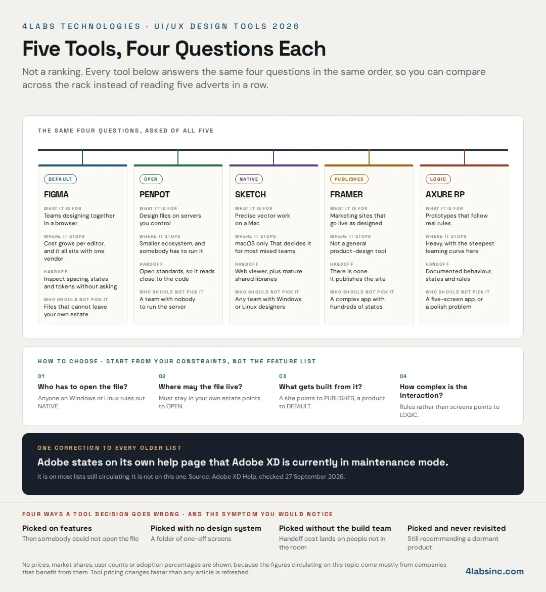
What it is for
Multiple people working in the same file at the same time, in a browser, with a shared component library underneath: that is the job Figma was built for, and it is still the one it does better than anything else.
The parts that matter in practice are the design system parts. Components with variants, so one button covers its whole family. Variables for colour, spacing and type, so a change lands everywhere. Auto layout, so a component survives a longer label instead of breaking. A plugin ecosystem large enough that whatever odd thing you need, somebody has built it.
For most product teams, a browser-based tool with real collaboration and a maintained design system is the whole requirement, and that is why it became the default rather than marketing.
Where it stops
Cost at scale is the first wall, and it is a shape rather than a number: you pay per person who edits, so that is fine at five designers and becomes a conversation when thirty product managers want to change a label themselves.
The second wall is concentration. The files, the system, the history and the prototypes live with one vendor, in a format the tools around it read best. That is not a criticism, it is what a default is, and it is only a problem if a policy, a client or a regulator says your design assets cannot sit in someone else's cloud, which is the case Penpot answers.
Handoff
Strong, and the main reason it holds teams. A developer opens a frame and reads spacing, type, colour and component state without a meeting. Variables map onto design tokens, which is what makes a system survive contact with code.
The honest caveat is that the generated code is a reference, not a build, so treat it as a specification a developer reads rather than output you ship, and it works very well. Prototypes handle motion and transitions well enough for review, which is where our post on the role of animation in user experience is worth reading alongside.
Who should not pick it
Teams whose files cannot live in a vendor's cloud. Teams whose prototypes need genuine conditional logic rather than click paths. And teams of one or two building marketing pages, who will get to a live site faster with Framer.
Penpot: the open-source one you can host yourself
What it is for. The same job as the default, on infrastructure you control: Penpot is open source and can be self-hosted, so the design files sit on your servers rather than a vendor's. It is browser-based and collaborative, and it is built on open web standards rather than a proprietary file format.
That matters in three situations, and they are more common than the SERP suggests. A client contract or a regulator says project assets stay inside your environment. Procurement will not approve another cloud subscription. Or you have been burned once by a tool changing terms and want the files somewhere you decide about.
Where it stops. The ecosystem is smaller: fewer plugins, fewer templates and fewer people who have already solved your odd problem. And self-hosting is not free just because the licence is: somebody has to run it, update it and back it up, which is real infrastructure work rather than a checkbox.
Handoff. Good, and philosophically different, because it is built on open standards, so what a developer inspects is closer to what they will write. For teams where designers and front-end developers sit together, that shortens the conversation.
Who should not pick it. A small team with nobody to run the server, if you self-host. Teams that depend heavily on a specific plugin. And anyone who needs the largest possible hiring pool of people already fluent in the tool.
Sketch: the native macOS vector editor
What it is for. Drawing, properly, on a Mac. Sketch is a native application rather than a browser tab, and it feels like one: fast on large files, precise, and with a mature library model that predates most of its competitors.
If your work is heavy on detailed vector craft, icon sets and tightly maintained symbol libraries, this is still a first-rate tool, and its age is an advantage rather than a liability. The conventions are settled.
Where it stops. macOS only, and that single fact decides it for most mixed teams before any feature comparison begins, because the product manager on Windows cannot open the file, and neither can the client.
Collaboration is real but arrived later than in browser-first tools, and it shows in how teams work around it rather than with it.
Handoff. Solid through its web viewer, where a developer can inspect without owning a Mac, and symbols and shared libraries translate cleanly into a design system. The friction is upstream, in who can open and edit, not downstream.
Who should not pick it. Any team with Windows or Linux designers. Any team whose stakeholders need to comment inside the file. And anyone starting fresh in 2026 without an existing Sketch library worth keeping.
Framer: design that publishes as a live site
What it is for. Skipping the handoff entirely: in Framer the design is the site and you publish it, so for a marketing site, a landing page or a launch microsite, that removes a whole stage from the process and a whole set of arguments with it.
It also means what you review is the real thing on a real device, not a prototype pretending. Responsive behaviour, interactions and page speed are all visible before anyone commits, and our post on responsive web design explains why that matters more than it used to.
Where it stops. It is not a general product-design tool, and treating it as one is the mistake to avoid, because a complex application with hundreds of states and a large component library is not what this was built for. You are also designing inside its publishing model, which is the trade you make for skipping the build.
Handoff. There usually is not one, which is the point, though where a Framer page has to feed a separate codebase, it is weaker than the others, because the output is a published site rather than a specification.
Who should not pick it. Product teams building a complex application. Teams whose engineering organisation owns the front end and will not host a site elsewhere. And anyone who needs one tool for both the marketing site and the product.
Axure RP: prototypes with real logic
What it is for. Interaction, not pictures: Axure prototypes hold conditional logic, variables, states and data, so a screen can behave differently depending on what the user did three steps earlier.
For enterprise software, that is the whole job, because a claims workflow, an approval chain, a pricing configurator or an internal admin tool is hard because of the rules rather than the visual design. A click-path prototype cannot test those rules, and a real one can, which is why Axure survives in a market that has otherwise consolidated.
It is also the tool that pays back most in user testing, because what you put in front of somebody actually responds. Our guide to running user testing on it covers how to get a usable answer out of that session.
Where it stops. It is heavy: the learning curve is steeper than anything else here, the visual output is less polished, and the collaboration model is not browser-native in the way the others are.
Handoff. Specification-led rather than pixel-led, which suits its audience, so developers get documented behaviour, states and rules. It is the only tool on this list where the prototype itself can serve as functional documentation.
Who should not pick it. A small team building a five-screen app. Anyone whose bottleneck is visual polish rather than interaction rules. And teams without a business analyst or a product person willing to learn it properly.