Logo
Logo
ServicesIndustriesCase StudiesBlogsCareersLet's Connect
blue-white-icon
black-image
Logo
ServicesIndustriesCase StudiesBlogsCareersLet's Connect
burger-icon
hamburger
What Is User-Centered Design? Principles, Process and Where to Start
Blogs/User-Centered Design Basics

What Is User-Centered Design? Principles, Process and Where to Start

February 15, 2026
Share Now

Table of Contents

  1. 1. What is user-centered design?
  2. 2. User-centered design vs UX design
  3. 3. The four principles of user-centered design
  4. 4. The user-centered design process
  5. 5. How to start user-centered design
  6. 6. Why user-centered design matters
  7. 7. What user-centered design changes about a project
  8. 8. User-centered design examples you can recognise
  9. 9. Build it with 4Labs Technologies
  10. 10. Frequently asked questions

User-centered design, usually shortened to UCD, is designing a product around evidence about the people who will use it rather than assumptions about them. In practice that means involving real users from the first week to the last, and changing the design when what they do disagrees with what you expected. The international standard behind it, ISO 9241-210, describes the same thing in more formal language, and the idea underneath is that simple.
Most writing on this subject describes a process that needs a research team, a lab and a budget, which is why so many small teams read it and conclude it is not for them. This page is written by people who build the software afterwards through our web application development services, so it covers the full method and also the smallest honest version of it: five users, one prototype and an afternoon. It also covers when the research was wasted, which nobody writes down.

Stay Ahead With 4Labs

Get expert insights, security briefings, and the latest innovations in your inbox.

  • Afghanistan+93
  • Albania+355
  • Algeria+213
  • Andorra+376
  • Angola+244
  • Antigua and Barbuda+1268
  • Argentina+54
  • Armenia+374
  • Aruba+297
  • Australia+61
  • Austria+43
  • Azerbaijan+994
  • Bahamas+1242
  • Bahrain+973
  • Bangladesh+880
  • Barbados+1246
  • Belarus+375
  • Belgium+32
  • Belize+501
  • Benin+229
  • Bhutan+975
  • Bolivia+591
  • Bosnia and Herzegovina+387
  • Botswana+267
  • Brazil+55
  • British Indian Ocean Territory+246
  • Brunei+673
  • Bulgaria+359
  • Burkina Faso+226
  • Burundi+257
  • Cambodia+855
  • Cameroon+237
  • Canada+1
  • Cape Verde+238
  • Caribbean Netherlands+599
  • Cayman Islands+1
  • Central African Republic+236
  • Chad+235
  • Chile+56
  • China+86
  • Colombia+57
  • Comoros+269
  • Congo+243
  • Congo+242
  • Costa Rica+506
  • Côte d'Ivoire+225
  • Croatia+385
  • Cuba+53
  • Curaçao+599
  • Cyprus+357
  • Czech Republic+420
  • Denmark+45
  • Djibouti+253
  • Dominica+1767
  • Dominican Republic+1
  • Ecuador+593
  • Egypt+20
  • El Salvador+503
  • Equatorial Guinea+240
  • Eritrea+291
  • Estonia+372
  • Ethiopia+251
  • Faroe Islands+298
  • Fiji+679
  • Finland+358
  • France+33
  • French Guiana+594
  • French Polynesia+689
  • Gabon+241
  • Gambia+220
  • Georgia+995
  • Germany+49
  • Ghana+233
  • Gibraltar+350
  • Greece+30
  • Greenland+299
  • Grenada+1473
  • Guadeloupe+590
  • Guam+1671
  • Guatemala+502
  • Guinea+224
  • Guinea-Bissau+245
  • Guyana+592
  • Haiti+509
  • Honduras+504
  • Hong Kong+852
  • Hungary+36
  • Iceland+354
  • India+91
  • Indonesia+62
  • Iran+98
  • Iraq+964
  • Ireland+353
  • Israel+972
  • Italy+39
  • Jamaica+1876
  • Japan+81
  • Jordan+962
  • Kazakhstan+7
  • Kenya+254
  • Kiribati+686
  • Kosovo+383
  • Kuwait+965
  • Kyrgyzstan+996
  • Laos+856
  • Latvia+371
  • Lebanon+961
  • Lesotho+266
  • Liberia+231
  • Libya+218
  • Liechtenstein+423
  • Lithuania+370
  • Luxembourg+352
  • Macau+853
  • Macedonia+389
  • Madagascar+261
  • Malawi+265
  • Malaysia+60
  • Maldives+960
  • Mali+223
  • Malta+356
  • Marshall Islands+692
  • Martinique+596
  • Mauritania+222
  • Mauritius+230
  • Mayotte+262
  • Mexico+52
  • Micronesia+691
  • Moldova+373
  • Monaco+377
  • Mongolia+976
  • Montenegro+382
  • Morocco+212
  • Mozambique+258
  • Myanmar+95
  • Namibia+264
  • Nauru+674
  • Nepal+977
  • Netherlands+31
  • New Caledonia+687
  • New Zealand+64
  • Nicaragua+505
  • Niger+227
  • Nigeria+234
  • North Korea+850
  • Norway+47
  • Oman+968
  • Pakistan+92
  • Palau+680
  • Palestine+970
  • Panama+507
  • Papua New Guinea+675
  • Paraguay+595
  • Peru+51
  • Philippines+63
  • Poland+48
  • Portugal+351
  • Puerto Rico+1
  • Qatar+974
  • Réunion+262
  • Romania+40
  • Russia+7
  • Rwanda+250
  • Saint Kitts and Nevis+1869
  • Saint Lucia+1758
  • Saint Pierre & Miquelon+508
  • Saint Vincent and the Grenadines+1784
  • Samoa+685
  • San Marino+378
  • São Tomé and Príncipe+239
  • Saudi Arabia+966
  • Senegal+221
  • Serbia+381
  • Seychelles+248
  • Sierra Leone+232
  • Singapore+65
  • Slovakia+421
  • Slovenia+386
  • Solomon Islands+677
  • Somalia+252
  • South Africa+27
  • South Korea+82
  • South Sudan+211
  • Spain+34
  • Sri Lanka+94
  • Sudan+249
  • Suriname+597
  • Swaziland+268
  • Sweden+46
  • Switzerland+41
  • Syria+963
  • Taiwan+886
  • Tajikistan+992
  • Tanzania+255
  • Thailand+66
  • Timor-Leste+670
  • Togo+228
  • Tonga+676
  • Trinidad and Tobago+1868
  • Tunisia+216
  • Turkey+90
  • Turkmenistan+993
  • Tuvalu+688
  • Uganda+256
  • Ukraine+380
  • United Arab Emirates+971
  • United Kingdom+44
  • United States+1
  • Uruguay+598
  • Uzbekistan+998
  • Vanuatu+678
  • Vatican City+39
  • Venezuela+58
  • Vietnam+84
  • Wallis & Futuna+681
  • Yemen+967
  • Zambia+260
  • Zimbabwe+263
Our Services
Digital Marketing
Staff Augmentation
IT Infrastructure
ERP Solutions
Software Development
Web & App Development
Industries
Cryptocurrency and Blockchain
Banking, Financial Services, and Insurance (BFSI)
Lending and FinTech
Oil and Gas
Energy and Utilities
Automotive and Manufacturing
Agriculture
Real Estate
E-commerce and Retail
Case Studies
Financial Services Test Automation
AI-Driven Customer Risk Profiling
Elevating Mobile Performance
Jewelry Client Transformation
AI Underwriting Revolution
Advanced Cybersecurity Solutions
Eyewear Retailer Transformation
Revolutionizing Manufacturing Operations
Offshore Development Excellence
Company

About Us

Careers

Let's Connect

Business Referral

Engagement Model

Partnership Programs

Resources

Blogs

footer1-iconfooter2-iconiso_iconiso_icon2

4labsicon

Copyright © 2026 4Labs Technologies. All Rights Reserved.

Privacy Policy

Terms & Conditions

Accessibility

fb-icon
twitter-icon
instagram-icon
linkedin-icon

What is user-centered design?

User-centered design is a way of working, not a stage in a plan. You find out how people currently do the thing your product will help with, you build something small, you watch them use it, and you change it based on what you saw. Then you do that again. The users are present at the start, in the middle and after launch, rather than being consulted once at a kick-off workshop.
The word evidence is doing the heavy lifting in the definition. A team practising UCD does not argue about whether the sign-up form is confusing. They watch four people try it, and after the second person stops at the same field the argument is over. Everything else in this article is machinery for producing that moment cheaply and often.
ISO 9241-210 sets out the same idea as a set of requirements: base the design on an explicit understanding of users and their context, involve users throughout, drive the design with user-centred evaluation, iterate, address the whole user experience, and include a range of skills in the team. If you need a citable source for a proposal, that is the one. If you need something to do on Monday, the rest of this page is more use.

What user-centered design replaces

The default it replaces is not a method with a name; it is designing for yourself.
That happens for good reasons. The team knows the product better than anyone, they use it every day while building it, and it feels obvious to them. That familiarity is exactly the problem, because a new user arrives with none of it. What reads as clear to the person who named the button is frequently opaque to everyone else.
The second default is designing by opinion, where the loudest or most senior view wins. This is worse than designing for yourself, because it is confident and it is not testable. UCD does not settle these arguments with a better argument. It settles them by going and looking.

Is user-centered design the same as human-centered design?

In everyday use, yes. The two terms are used interchangeably by most teams, most agencies and most job adverts, and if somebody says human-centered design in a meeting they almost certainly mean the thing described on this page.
There is one distinction worth knowing. Human-centered design is the broader term, used for problems where the people affected are not all users of a product. Designing a hospital discharge process touches patients, families and staff, and some of them never touch the software. User-centered design is the narrower version aimed at people using a product.
The live version of this article used both terms interchangeably without saying so, and that is the norm across the field. For a web or mobile application the distinction almost never changes what you do.

User-centered design vs UX design, design thinking and usability

Five terms get used for overlapping things, often inside one article, and the reader is left assuming there are five methods to choose between. There are not. They are one field described at different zoom levels, and here is the short version.

Term What it actually refers to Scope
User-centered design A way of working: involve users, test, iterate A method
Human-centered design The same method, applied to people who may not be users A method, broader
UX design The job and the craft of shaping the experience A discipline
Design thinking A workshop-friendly framing: empathise, define, ideate, prototype, test A framing
Usability A property of the finished thing: can people do the task A quality

Read that table once and the confusion resolves. UX design is the job somebody does, and user-centered design is how they do it well. Design thinking is a way of getting a room full of non-designers to take part. Usability is what you are measuring when you test.
One practical consequence. If a supplier tells you they do UX design, you have learned what they call themselves, not how they work. The question that separates them is whether they will show you what real users did with the prototype, and when. A team that cannot answer that is doing design, not user-centered design.

The four principles of user-centered design

Four principles carry the method. Each one has a condition attached, because a principle stated as a slogan is easy to agree with and easy to ignore.

Involve real users, early

Real means people who will use the thing, not colleagues, not the sales team, and not a friend who works in tech. Colleagues are too close to the product and too polite about it.
Early means before the design is finished, which sounds obvious and is rarely what happens. Most teams show users a build that is already paid for, at which point the feedback can only be filed for later. The test is whether the schedule still allows the design to change when the session ends. If it does not, the session is not user research, it is reassurance.
The condition: somebody has to be able to reach these people. If your users are hospital consultants or warehouse supervisors, access is the hard part of the whole method, and it is worth solving before anything else.

Design iteratively

Iteration means building a version, learning something, and changing it. Three small rounds beat one large one, because each round tells you what to look at in the next.
What this rules out is the single review at the end. A design signed off once, built, and shown to users at launch has had no iteration at all, whatever the process document says.
The condition: the plan has to have room in it. A schedule with no slack cannot iterate, and a team that has promised a fixed scope on a fixed date will quietly stop testing when the first finding threatens the date. That is a planning failure, not a design one.

Design for the whole experience

The product is not only the screens. It is the sign-up email that lands in spam, the error message that says an error occurred, the loading state on a slow connection, and the support page somebody reads at eleven at night.
Those parts are usually owned by nobody. The developer wrote the error text in a hurry, marketing wrote the email, and nobody has read the sequence end to end as a single experience. Doing that once, out loud, is one of the cheapest improvements available to any team. Where this matters most is on small screens, which is why our piece on mobile app UX design goes further, and why responsive web design is part of the same question rather than a separate one.
The condition: somebody has to own the whole path. If three teams own three pieces, the joins are where the experience breaks.

Make accessibility part of the design, not an audit

Accessibility means the product works for people using a screen reader, a keyboard instead of a mouse, a magnified display, or a phone in bright sunlight with one hand full. It is not a separate feature for a separate group.
Treated as an audit at the end, it produces a list of failures that are expensive to fix because they are structural: colour choices baked into a design system, form fields that were never labelled, a navigation pattern that cannot be reached by keyboard. Treated as part of design, most of it costs nothing. Labelling a field properly takes the same time as labelling it badly.
The condition: somebody on the team has to know what to check. The WCAG guidelines are the reference, automated tools catch the mechanical failures, and a person is still required for the rest. An automated check can confirm an image has alt text, not that the alt text is any use.

The user-centered design process, stage by stage

Four stages, and the fourth loops back to the first. What follows is the full version. The cut-down version, which is what most teams should actually run first, is in the next section.

Research: understanding users and context

The goal is to learn how people do the thing today, including the parts they have stopped noticing.
Interviews work best when you ask about the last time rather than the usual time. Tell me about the last invoice you chased gets you a story with detail in it. How do you usually chase invoices gets you a tidied-up summary that is not quite true.
Observation beats asking. Watch somebody do the task at their own desk and you will see the spreadsheet they keep alongside your software, the shortcut they use forty times a day, and the step everyone skips. None of that appears in an interview, because it is too ordinary to mention.
Existing evidence is free and usually ignored: support tickets, search logs, the questions sales gets asked twice a week, and the analytics screen where everyone leaves. Start here before commissioning anything.
When you cannot reach users, say so plainly and work from the nearest proxy — the support team, the account managers, the recordings. Write down that you are working on a proxy, so the team does not later mistake it for evidence.

Define: turning research into requirements

Research that stays in a document changes nothing, so this stage turns it into something the team can design against.
Personas are short descriptions of the main kinds of user: what they are trying to do, what gets in the way, what they already know. Built from real interviews they keep a team honest. Invented in a workshop from nothing, they are theatre, and a smaller team is usually better off with two sentences per user type than a set of laminated cards with stock photographs on them.
Scenarios are more useful and less popular. A scenario is one person trying to do one thing in a specific situation: a warehouse supervisor, on a phone, one-handed, needs to confirm a delivery that arrived short. Design against that and the awkward cases surface early.
Requirements come out of the scenarios. At this point the team should be able to say what the product must let somebody do, in plain language, before anybody draws a screen.

Design: information architecture, wireframes and prototypes

Information architecture is how the content and functions are organised: what is grouped with what, what is called what, and what is one click away. It is the most consequential design work and the least visible, because a user only notices it when they cannot find something.
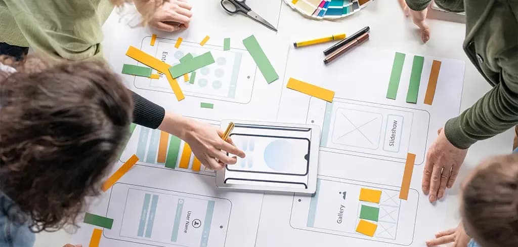
Wireframes are layout without decoration: boxes, labels, hierarchy. They are deliberately ugly, so that a review discusses whether the right things are on the screen rather than the shade of blue.
Prototypes are clickable versions good enough to put in front of somebody. A prototype is not a smaller build. It exists to be tested and thrown away, and treating it as the start of the build is how teams end up shipping a rough draft. Our roundup of UI UX design tools covers what teams use for this, and animation in user experience covers a part of the design that is easy to overdo.

Test and iterate: usability testing

A usability test is one person, one prototype, and a set of tasks. You ask them to do something and you watch. You do not explain, and you do not rescue them, because the silence is where the finding is.
Five users per round is what most teams run, several rounds rather than one big one. The first two sessions usually turn up most of what a round will find, and by the fifth you are watching people fail in ways you have already written down.
What you are looking for is not opinions. I like the blue one is worth almost nothing. What matters is whether they completed the task, where they hesitated, what they said they were looking for and did not find, and what they did after getting stuck. Our guide to running effective user testing goes through how to run a session properly.
Then change the design and run it again, because a test with no change afterwards was a demonstration.

Where the loop actually closes

The process is usually drawn as a circle, which implies it keeps going after launch, and in most teams it does not.
What happens instead is that the product ships, the team moves to the next thing, and the evidence about how people actually use it — analytics, support tickets, the questions that keep arriving — goes to different people who are not the ones who could act on it.
Closing the loop means someone reviews that evidence on a schedule and it reaches the team that can change the design. A half-hour every month looking at the top five support questions and the point where people abandon the main flow is enough for most products. That half-hour is the difference between a circle on a diagram and a circle in real life.

How to start user-centered design with a small team

Everything above assumes people and time. Most teams reading this have neither, and conclude that user-centered design is something other companies do. That conclusion is wrong, and this section is the reason the page exists.
The method scales down further than almost anybody writes. You do not need a researcher, a lab, a recruitment agency or a budget line. You need five people and an afternoon.

The smallest version that still works

Pick one thing: not the product. One flow that matters: signing up, placing an order, finding a record. One flow is enough to learn from and small enough to finish.
Find five people who will use it: customers, people who asked for a demo, people who left. Anyone except your own team. Offer them twenty minutes and something small for their time.
Make something to test: a clickable prototype is ideal. Drawings on paper work. The current version of your product works if it already exists. The thing being tested does not have to be built, and if it is already built you have left this too late.
Book five sessions in one afternoon: twenty minutes each, two people in the room, one asking and one writing. Give the person a task, then stop talking and let them struggle, because the struggle is the finding.
Write down what happened, not what was said: where they stopped, what they clicked that did nothing, what they expected to find. Three lines per session is enough.
Change something the same week: one or two changes, not a backlog. Then do it again next month with the changed version.
That is it, and that afternoon costs less than one day of build time and routinely saves several weeks of it.
What to skip at this size: a research plan, a persona document with photographs, a journey map on the wall, a recruitment agency, a recording and transcription tool, and a report. All of those are for teams running this continuously across several products. None of them is what makes the method work. Watching somebody fail is what makes the method work.

When user research gets wasted

Research can absorb weeks and change nothing, in three ways, and all three are common.
Personas invented from nothing: a workshop produces four characters with names, ages and hobbies, and no interview took place. The document then gets cited for two years as if it were evidence. Two honest sentences about who the users are beats four fictional biographies.
A survey that confirms what you already believed: surveys are popular because they scale and feel objective. They are also the easiest instrument to bias, and a survey written by somebody with a preferred answer will get it. If you want to know whether people can use the thing, watch them use it.
A usability test after the build is finished: this is the most expensive version, because the findings are real and the schedule has no room for them. The report gets filed under phase two, and phase two does not arrive. Test while the design can still change, or do not spend the money.
A fourth one worth naming: research nobody reads. A forty-page report that took three weeks is read by its author. Three lines per session, shared the same day, changes more.

Why user-centered design matters

Five benefits, each with the condition attached. No figures, because the figures published on this subject are recycled from sources that do not survive checking, and a borrowed percentage will not survive the meeting you take it into either.
Fewer expensive reversals: a change to a prototype takes an hour. The same change after launch touches code, tests, documentation, training and anyone already using it. Moving the discovery earlier is where the saving lives. The condition is that somebody acts on what the session found; a finding that arrives and is filed saves nothing.
More people finish the task: this is the benefit that shows up in whatever you measure, whether that is completed orders, submitted forms or tickets closed. Our piece on the impact of good UX design on conversion rate covers the commercial side. The condition is that you were testing the flow that matters rather than the one that was easiest to prototype.
Fewer support requests: most repeat support questions are design problems wearing a different hat. A label that means two things, a step people assume is optional, a confirmation that does not confirm. Fixing the design removes the question permanently. The condition is that support findings reach the design team, which in many companies they never do.
Accessibility comes as standard: designing for a keyboard, a screen reader and a small bright screen from the start costs almost nothing. Retrofitting it is structural work. The condition is that somebody on the team knows what to check, because good intentions do not label a form field.
Design arguments end faster: a team with evidence stops relitigating the same decision every fortnight. Four users stopping at the same field settles a debate that three senior opinions could not. The condition is that the team agreed in advance to treat what it sees as the answer.
What is deliberately missing here is a number. The widely quoted figures for the return on design spending, and for how much more a defect costs after launch, are repeated everywhere and trace back to sources that do not hold up. A benefit you can check against your own product is more useful than a statistic you cannot.

What user-centered design changes about a project

This is the part written for whoever is commissioning the work rather than doing it. Four things change, and none of them is a new line item called UX.
The schedule gets a slower start and a faster finish: the first two weeks produce less visible progress, which is uncomfortable if progress is measured in screens. What they produce instead is a set of decisions that would otherwise have been guessed. The time comes back at the end, because the rework that usually follows a launch is smaller.
The cost moves rather than grows: research and testing are real hours. They are considerably fewer hours than rebuilding a flow that shipped wrong, and they happen when changing things is cheap. A project that skips them has not saved the money, it has deferred it to a point where it buys less. Where budgets do genuinely grow is when a team commissions a research programme it did not need, which is what the small-team section is there to prevent.
Scope conversations get easier: a team with evidence can say which features people actually reached for and which nobody asked about. That makes cutting scope a decision rather than an argument, which matters most on a fixed budget.
What to ask a supplier for: if you are commissioning web application development or a mobile app, four questions separate a team that works this way from one that says it does.

  • When will I see real users using this, and at what stage?
  • What will you show me from those sessions? Ask for what people did, not a summary slide.
  • What happens if the sessions say the design is wrong? The answer should describe a change, not a change request.
  • Who owns accessibility, and when does it start?
    What a design deliverable should look like when it arrives: not only screens. Screens, plus what was tested, what happened, and what changed as a result. If the deliverable is a set of polished screens with no evidence behind them, you have bought decoration.
    The platform decision sits alongside this rather than before it. Whether a product should be a web application, a native app or a hybrid depends partly on how people will actually use it, which is something the research answers — our comparison of native vs hybrid mobile app development covers the rest of that decision.

User-centered design examples you can recognise

Three examples, described as decisions rather than brands. Each is a pattern you have met, and in each case the fix came from watching somebody rather than from a meeting.
The checkout that asked for the account first: a shop put account creation before payment, on the reasonable grounds that an account is useful later. Testing showed people abandoning at that screen, several of them saying out loud that they only wanted the one item. Moving account creation to after the payment, and making it optional, changed nothing about the code that takes money and removed the most common exit point on the site. The design decision was about order, not features.
The booking flow with the invisible second step: a booking tool showed dates on one screen and times on the next, with the second screen reached by a small link people read as more options. Half the testers filled in a date, waited, and then asked what to do next. The fix was a visible next step and a progress indicator, which is not a clever idea — it is an ordinary idea nobody had noticed was missing, because everyone on the team already knew the second screen existed.
The admin tool nobody could learn: an internal system had every function in one long menu, alphabetically. The people using it had learned four of the forty items and ignored the rest. Watching them showed that they thought in tasks, not functions, so the menu was regrouped around the six things they actually did. No new capability was built. Training time dropped because the structure now matched the work.
What the three have in common: the problem was structural rather than visual, nobody on the team could see it from the inside, and one afternoon of watching found it. Our PWA case study on user experience works through a fuller example on a real build.
No brand names and no figures appear here on purpose. A named case study with a percentage attached is the easiest thing to write and the hardest thing for a reader to verify or apply.

Build it with 4Labs Technologies

4Labs Technologies designs and builds web and mobile applications, with the user research and testing done as part of the build rather than sold as a phase of its own. Most projects that reach us do not need a research programme. They need five people looked at before the build starts, and somebody to act on what those five people do.

Work with our web application development team

From the point this page leaves you at, a first conversation is short. You describe what you are building and who will use it, and somebody tells you which parts are worth testing before the build and which are not. No design audit, no research proposal, and no recommendation to test things that do not need it.
What you bring: what you are building, who will use it, and whether anybody has spoken to those people yet. If the answer to the last one is no, that is the normal answer and it is where we start.
If you are building something and want the user side handled properly from the start, tell us what it is and who it is for. Let's Connect.
If you are earlier than that, the useful next step is one of the pages above: running effective user testing if you want to try the afternoon yourself, UI UX design tools if you need something to prototype with, or our web application development services page if you want to see how the work runs.

Frequently asked questions about user-centered design

What is user-centered design?

User-centered design is designing a product around evidence about the people who will use it rather than assumptions about them. Real users are involved from the start, the design is tested with them, and it changes based on what they do.

What are the principles of user-centered design?

Four carry the method: involve real users early, design iteratively, design for the whole experience rather than only the screens, and build accessibility in from the start instead of auditing for it at the end. ISO 9241-210 sets out a fuller list along the same lines.

What are the stages of the user-centered design process?

Research, define, design, then test and iterate. Research is interviews and observation, define turns that into scenarios and requirements, design produces information architecture, wireframes and prototypes, and testing puts those prototypes in front of real users. The fourth stage loops back to the first.

Is human-centered design the same as user-centered design?

In everyday use, yes, and most teams use the terms interchangeably. The one distinction is scope: human-centered design covers problems where the people affected are not all users of a product, while user-centered design is aimed at people using one.

What is the difference between UX design and user-centered design?

UX design is the discipline and the job. User-centered design is the method a UX designer uses to do that job well. A team can call itself a UX team and never put a design in front of a real user, which is the difference in practice.

Why does user-centered design matter?

It moves discovery of problems from after launch to before it, when changing things is cheap. More people finish the task, fewer support questions repeat, accessibility comes as standard, and design arguments end with evidence rather than seniority.

How do you start user-centered design with a small team?

Pick one flow, find five people who will use it, make a clickable prototype or even paper drawings, run five twenty-minute sessions in one afternoon, write three lines per session, and change something the same week. No researcher, lab or budget line is required.

How many users do you need for a usability test?

Five per round is what most teams run, with several rounds rather than one large one. The first two sessions usually surface most of what a round will find, and running three rounds of five teaches more than one round of fifteen.

Do you need personas?

Only if they are built from real interviews. Personas invented in a workshop are fiction that gets quoted as evidence for years. A small team is usually better served by two honest sentences per user type, or by scenarios describing one person doing one task in a specific situation.

When does user research get wasted?

When personas are invented from nothing, when a survey is written by somebody who already knows the answer they want, when a usability test happens after the build is finished and the schedule cannot absorb the findings, and when the output is a long report nobody reads.

How does user-centered design affect a project's cost and timeline?

The start is slower and the finish is faster. The cost moves rather than grows, because research hours are fewer than the hours spent rebuilding a flow that shipped wrong. Budgets genuinely grow only when a team commissions a research programme larger than the product needs.

What does accessibility have to do with user-centered design?

Accessibility is user-centered design applied to people using a screen reader, a keyboard, a magnified display or a phone in bright sunlight. Built in from the start it costs almost nothing; audited at the end it produces structural problems that are expensive to fix.

‹ PreviousNext ›